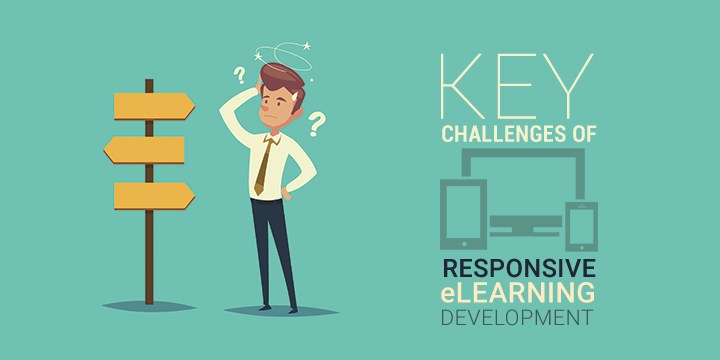
4 Key Challenges of Responsive eLearning Development
Responsive eLearning is a topic we have touched base upon a couple of times. We have discussed in detail about why it is the need of the hour, the key reasons to opt for responsive design, and even compared it with adaptive design.
While Responsive eLearning gives the option of delivering a dynamic learning experience, giving the learners an option to learn on any device, the development of such eLearning is no child’s play! Responsive eLearning development has its own set of challenges that need to be overcome in order to deliver good quality end product. Here are 4 key challenges and the globally accepted solutions too.
1. Breakpoints & Fonts
One of the key aspects of Responsive design is that it fluidly fits any screen size and the trick here is nothing but setting the breakpoints right. This can also be a challenge in some cases where the types of devices aren’t clearly specified. In such situations it’s advisable to be generic. The ideal way however, is to start with the smallest device and move on to the bigger ones.
Authoring tools offer as much as 5 default breakpoints, allowing us to design for desktop, tablet landscape and portrait, and smartphone landscape and portrait views.
What comes next are the font size, font type etc. According to Robert Bringhurst, “Anything from 45 to 75 characters is widely regarded as a satisfactory length of line for a single-column page set in a serifed text face in a text size.” Font size for responsive eLearning should ideally be set using ‘em’ units which dynamically sets font size and spacing optimally on various screen sizes. Sans Serif fonts are recommended and italics are to be avoided.
2. Media Elements
When it comes to Responsive eLearning, Images and graphics have to be scaled across various devices. A different size image is to be used for larger devices and small devices, as scaling up of the image for mobiles can be pixelated when seen on larger screen.
To overcome this images or graphics are usually imported in form of JPGs and PNGs, scaled dynamically, or cropped to fit smaller screen or even dynamically cropped and scaled.
Animations bring its own set of challenges. Flash animations are not supported by mobile devices and are hence converted to SVGs. CSS Sprite sheets are best used in case of short, looped animations.
3. Navigation
Before responsive design came in, eLearning used to have a fixed format. The navigation used to be similar for all. However, with the fluid design model, even the navigation panel tends to be modified depending on the device. The design creativity also leads to complicated navigation at times.
The solution here, is to design navigation in a way that it is self-explanatory. To do so, it is important to understand the way in which learners navigate, the common patterns etc.
4. Content Volume
Responsive eLearning needs a lot of planning in terms of content usage and optimization as it can be accessed both on desktops and mobiles, where in the experience can be hampered by slow loading. Responsive design should render seamless experience on any device and how so?
The solution is conditional loading wherein only the content required on a particular screen is loaded, followed by enhancements and other elements. With mobile first approach designers really sort out the most essential elements in order to deliver an optimized output.
Apart from the above mentioned challenges, responsive eLearning development and testing takes longer time due to the multiple combination of OS-browsers-and-devices that have to be dealt with. To add to that older versions of certain browsers do not support CSS media queries too.
With more and more organizations gaining awareness about the benefits of using responsive eLearning, there is an increased demand for converting the existing eLearning to responsive versions too. We have helped many organizations in their step towards responsive eLearning and are always ready to assist.
Do share your comments below.